Formulários
- Dicas relacionadas a formulários
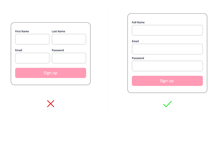
Single column forms
Single column forms offer a clean and simple design that is easy to understand and navigate.
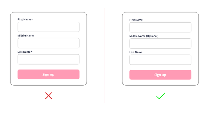
Use (Optional) instead of (*)
Using (Optional) instead of an asterisk (*) is a more clear and accessible way to communicate to users that a field in a form is not mandatory.
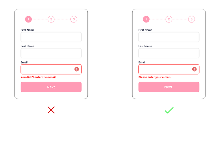
Use positive error messages
Using positive error messages in UI design is an effective way to improve the user experience and create a more user-friendly application or website.
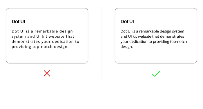
Don’t use letter spacing unnecessarily
While letter spacing can be used effectively in UI design to improve readability and visual appeal, it should be used judiciously and not unnecessarily.
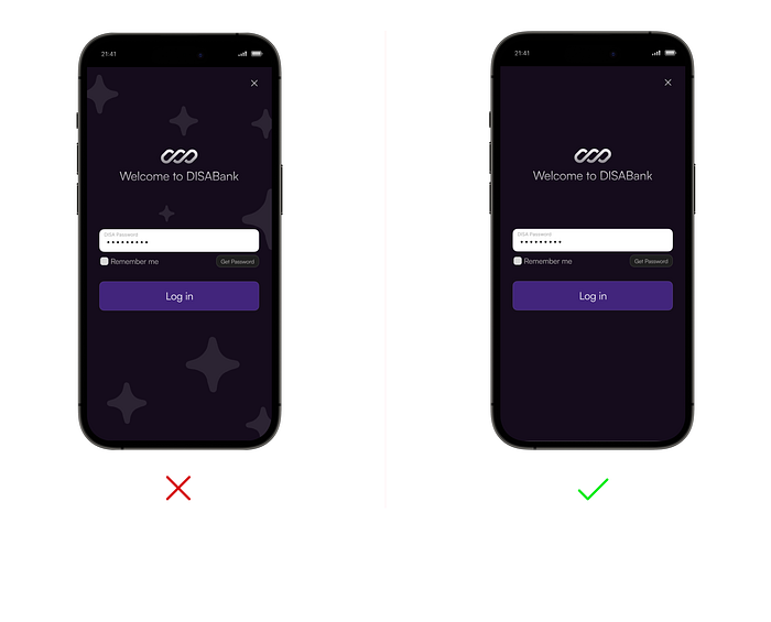
Avoid using ridiculous backgrounds
A ridiculous background may not be consistent with the overall branding or design of the site or application. This can make the design appear disjointed and unprofessional.
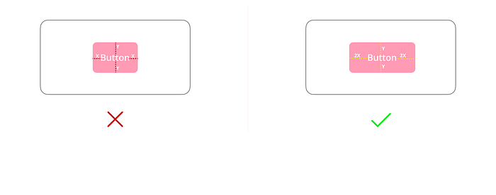
Using white space
White space is used to create a sense of balance and harmony in the overall design of the user interface.
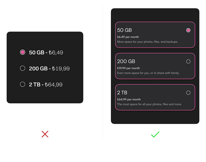
Highlight input format with placeholders
Cards are more useful when you want to present a range of options or items that may have different levels of importance or complexity.
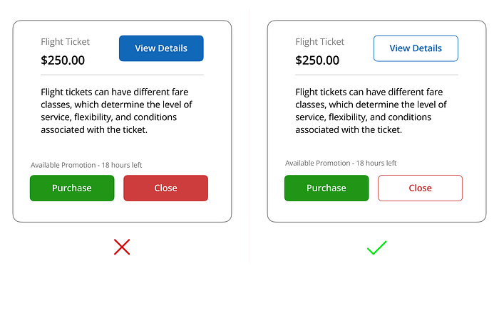
Highlight the correct button
The correct button should be easy to identify and visually distinguishable from other elements on the screen.
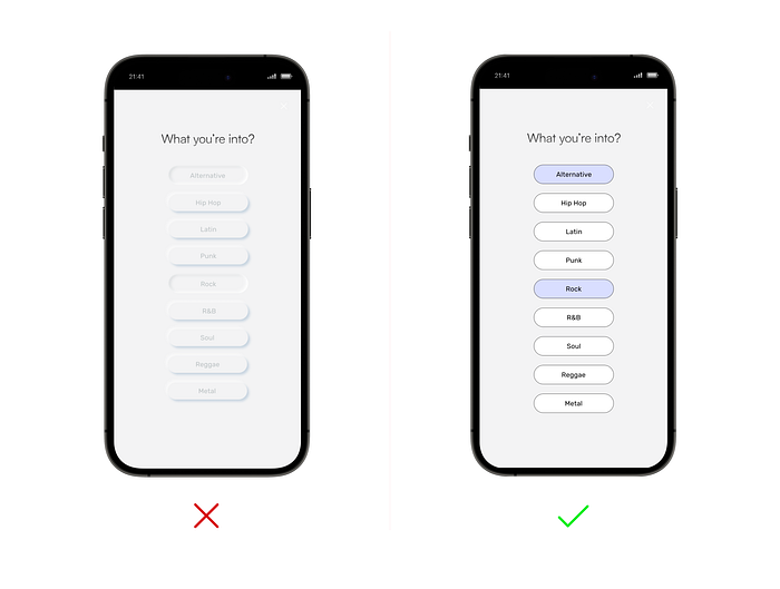
The neumorphism is no usable
The neumorphism is no usable and doesn’t work in real apps!