Crafting a Toggleable Sidenav in Angular
- Crafting a Toggleable Sidenav in Angular

TL;DR
We manage the sidenav state using a SidenavService class, design and style a rotating toggle button, adjust the sidenav width with HostBinding when that button is clicked, handle content overflow by modifying container styles, and enhance the user experience with a smooth transition during sidenav expansion and collapse.
Intro
In this article, we’ll go through how to implement a collapsible sidenav in Angular, enhancing user experience with efficient screen space usage.
We’ll cover sidenav state management, styling, and animation to create a seamless and functional collapsible sidenav for your Angular projects.
This builds on top of the base sidenav we implemented in this article:
Implementation
Step 1: Managing State
We’ll store and manage the status of the sidenav in the SidenavService class. This allows us to change the sidenav state from pretty much any where in the app.
We can setup this state management in sidenav.service.ts as follows:
export class SidenavService {
  isExpanded = true;

  toggleSidenav() {
    this.isExpanded = !this.isExpanded;
  }

  expandSidenav() {
    this.isExpanded = true;
  }

  collapseSidenav() {
    this.isExpanded = false;
  }
}
This is the last time we’ll modify the service. As you can see, managing the state itself is quite straight-forward; But the devil is in the styling details as we’ll see in the following section.
Step 2: Creating a Toggle Button Element
The button is pretty simple. It’s a circle with an icon in the center which flips 180 degrees depending on whether the sidenav is toggled open / closed (i.e. from a left arrow to a right arrow).
The template for this button can be placed in sidenav.component.html, right under the sidenav body itself:
<!-- previous code omitted ... -->

<button
  class="toggle-button"
  (click)="this.sidenavService.toggleSidenav()"
  [class.is-flipped]="sidenavService.isExpanded"
>
  <mat-icon icon>chevron_right</mat-icon>
</button>
Let’s go through this step by step:
- We assign a
toggle-buttonclass to style the button later in CSS - We bind the button’s
clickevent to toggle the sidenav using the sidenav service - We assign a class
is-flippedwhen the sidenav is expanded, and we make the icon point right by default which seems like the wrong direction, but we’ll set it up correctly once we’re in the CSS.
Now, onto styling the button. First, let’s get the code out of the way. We can place these styles in sidenav.component.scss right under all the other styles:
.toggle-button {
  display: flex;

  align-items: center;
  justify-content: center;

  $size: 25px;
  width: $size;
  height: $size;
  margin: 0;
  padding: 0;

  position: absolute;
  top: 48px;
  right: calc($size / -2) - 2px;

  border: 1px solid gray;
  border-radius: 50%;

  background-color: white;

  cursor: pointer;

  &:hover {
    border: 2px solid rgb(36, 82, 231);
  }

  &.is-flipped {
    transform: rotate(-180deg);
  }

  mat-icon {
    font-size: 1.5em;

    width: fit-content;
    height: fit-content;
  }
}
Let’s go through these section by section. First, the display properties:
display: flex;

align-items: center;
justify-content: center;
These simply center whatever content we have in the button.
Next, the size and position attributes:
$size: 25px;
width: $size;
height: $size;
margin: 0;
padding: 0;

position: absolute;
top: 48px;
right: calc($size / -2) - 2px;
We define a variable because we’ll be reusing the same value for size in multiple different places. We use that value for the width and height, and we reset the padding and margins that come by default for buttons so that centering works correctly.
Then, we position the button absolutely from the top and right. The top attribute sets the button’s distance from the top, while the right decides where along the right side of the sidenav the button stays. In this case, we make the button centered on the sidenav’s right border by moving it to the right by exactly half its own size (plus a little correction).
The final bunch of styles makes things look nicer:
border: 1px solid gray;
border-radius: 50%;

background-color: white;

cursor: pointer;

&:hover {
  border: 2px solid rgb(36, 82, 231);
}

&.is-flipped {
  transform: rotate(-180deg);
}

mat-icon {
  font-size: 1.5em;

  width: fit-content;
  height: fit-content;
}
We define a border and make the button circular using border-radius of 50%. We make that border blue when the user hovers on the button.
Using the &.is-flipped selector, we simply do a transform and flip the button 180 degrees (whether it’s negative or not changes how the button rotates but is not really important).
Finally, we make the icon fit the button properly by making it slightly bigger and updating its width and height.
Phew! You wouldn’t expect such a tiny little button to have so many styles! But the button is officially done now. You should have something that looks like this:
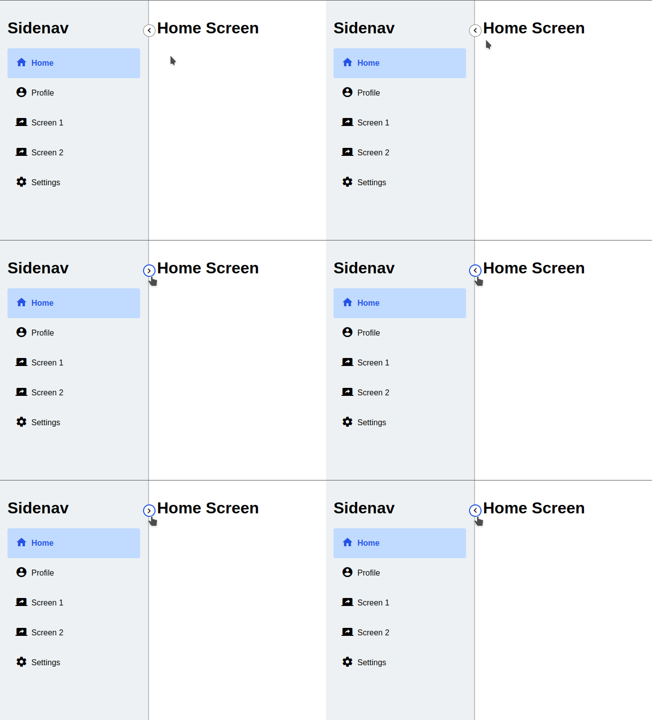
Step 3: Adding Toggle Logic
First of all, let’s define how small we want the sidenav to be when it’s collapsed. We already have a variable for the full sidenav width in styles.scss, so let’s add a new one for the collapsed sidenav width:
:root {
  --sidenav-width: 300px;  // <- already exists
  --sidenav-collapsed-width: 20px;  // <- we define a new one
}
This will help us keep track of what our sidenav width is under different conditions.
Now, the sidenav’s width is controlled by the width attribute in the :host selector in sidenav.component.scss.
:host {
  height: 100vh;
  width: var(--sidenav-width);

  // ...
}
Remember:The selector in Angular allows us to select the wrapping component itself, in this case, the and apply styles to it directly. ()
So, what we want to do is to handle the width in a smarter way. Basically, here’s how we could do it:
:host {
  height: 100vh;

  // by default
  width: var(--sidenav-collapsed-width);

  &.is-expanded {
    width: var(--sidenav-width);
  }

  // rest of styles ...
}
The sidenav is set to the collapsed width by default, and when the is-expanded class is assigned to it, it uses the full width instead. But wait, when and how are we assigning this class?
This is what we take care of in the next step. We’ll be utilizing Angular’s HostBinding to set this up in sidenav.component.ts as follows:
export class SidenavComponent {
  constructor(public sidenavService: SidenavService) {}

  @HostBinding('class.is-expanded')
  get isExpanded() {
    return this.sidenavService.isExpanded;
  }
}
This is, in essence, equivalent to writing this in app.component.html:
<app-sidenav [class.is-expanded]="sidenavService.isExpanded"></app-sidenav>
It’s important to make the method decorated by the HostBinding a getter, otherwise the sidenav won’t update its width correctly.
The sidenav toggle feature is now just about functional. Here’s what we have so far:
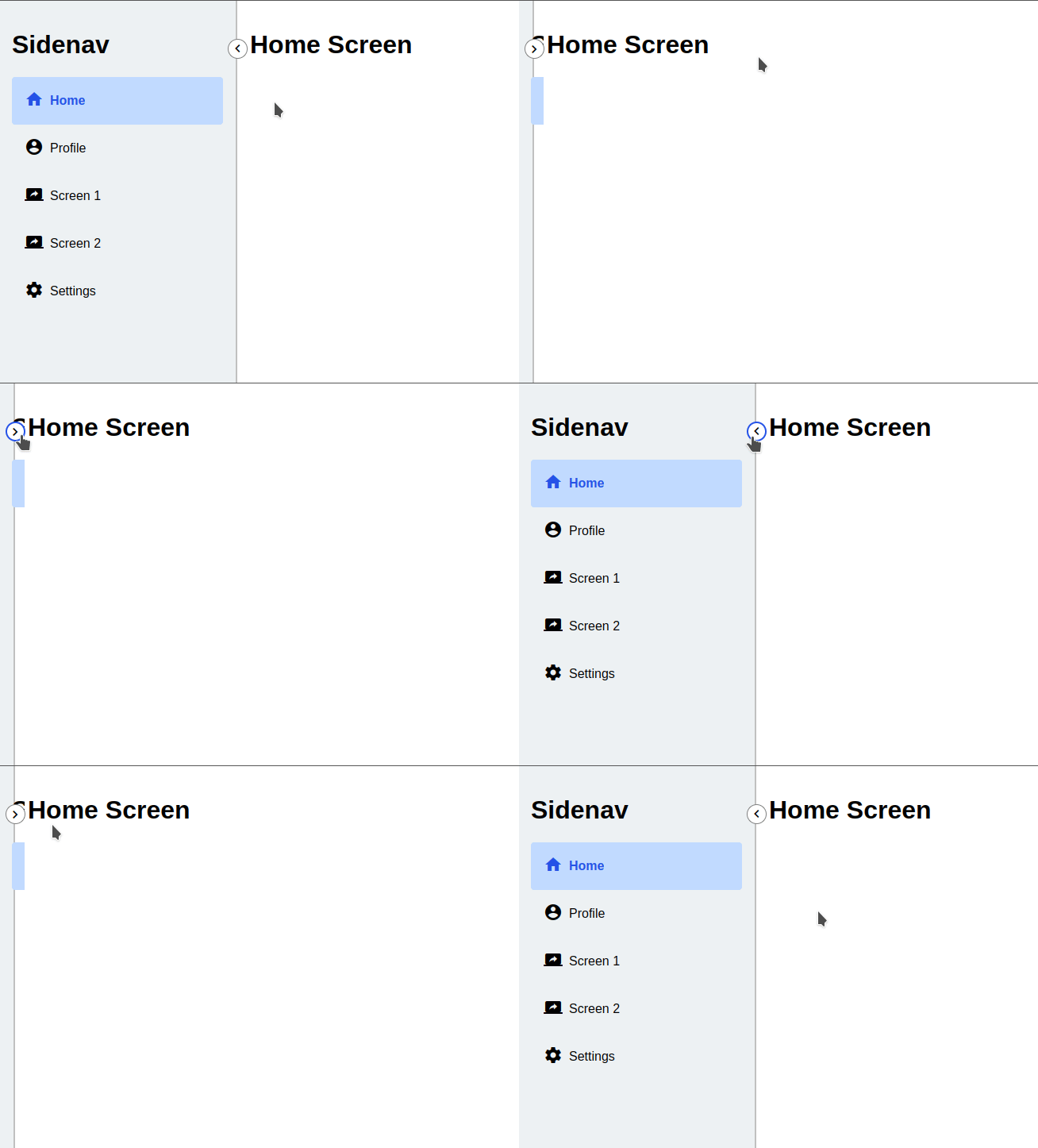
Something weird is happening with the content inside the sidenav when we collapse the sidenav itself. It’s overflowing. We’ll explain and solve this in the next step.
Step 4: Handling Content in Collapsed Sidenav
Last step is to make the content of the sidenav unaffected by the sidenav’s width. This will involve some CSS trickery. Before moving on, let’s try and understand the underlying cause.
Currently, we have the following structure in sidenav.component.html:
<div class="sidenav-body-container">
  <!-- Content ... -->
</div>

<!-- Toggle Button ... -->
Where the following styles are applied to the .sidenav-body-container class:
.sidenav-body-container {
  overflow-y: auto;

  height: 100%;

  padding: 16px;

  box-sizing: border-box;
}
So the issue is that the content is basically being squished out of its position and overflowing.
Weirdly, adding an overflow-x: hidden doesn’t solve it. We still have the exact same issue.
What if we added it to the :host styles?
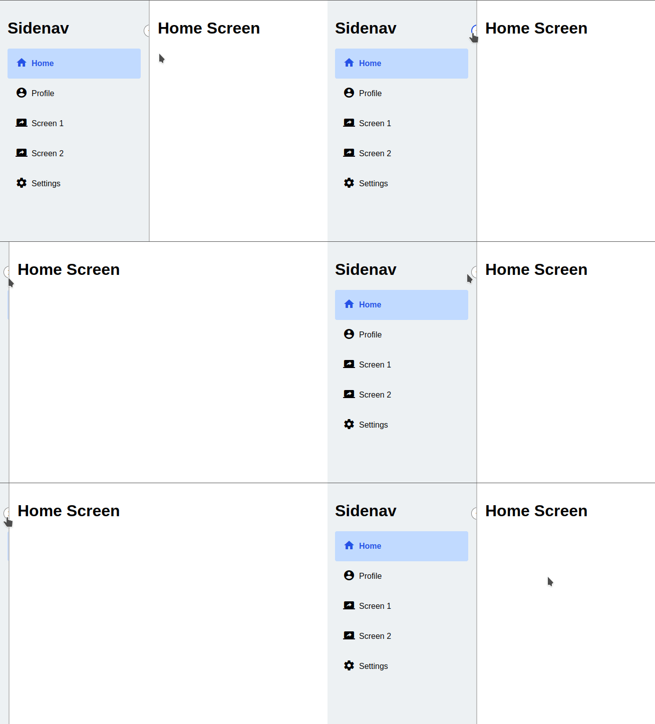
Well, yeah it works, but now we’re missing half our button and we kind of need it. So clearly, this is not the way. What to do then?
The solution is move the overflow handling to another container within the sidenav body. First of all, We’re going to change our template structure into the following (in sidenav.component.html):
<div class="sidenav-body-container">

  <div class="sidenav-body">
    <!-- Content ... -->
  </div>

</div>
We keep the div with the sidenav-body-container class, but we add another one inside it with a sidenav-body class. Perhaps you can find more creative names, but since we’re not really going to touch these again, I thought simple names are enough.
Anyway, the trick is now in the styling of the sidenav-body class. Here’s how we can make it handle overflowing the way we want. Add the following right after the sidenav-body-container class in sidenav.component.scss:
.sidenav-body {
  width: 100%;

  overflow-x: hidden;
}
Like magic, everything looks the way it should now:
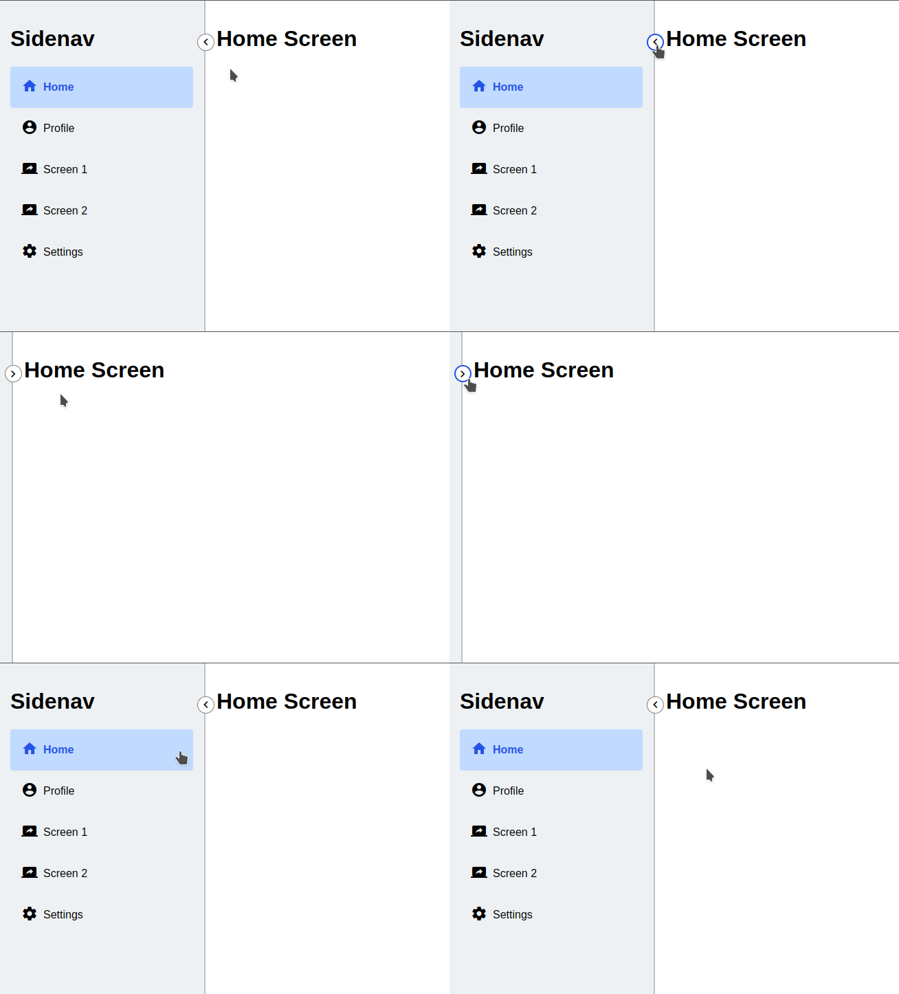
The basic sidenav functionality is done at this point. Though we could add one last thing to make the UX better.
Step 5: Smoothing Things Out
This is an optional step, but it makes the sidenav handle better when expanding / collapsing.
We can add a very simple transition with a custom curve to make it snappy but buttery-smooth at the same time.
We can do this by adding the following to the :host styles in sidenav.component.scss:
:host {
  // ...

  transition: transition: width 300ms cubic-bezier(.02,.68,.63,.98);
}
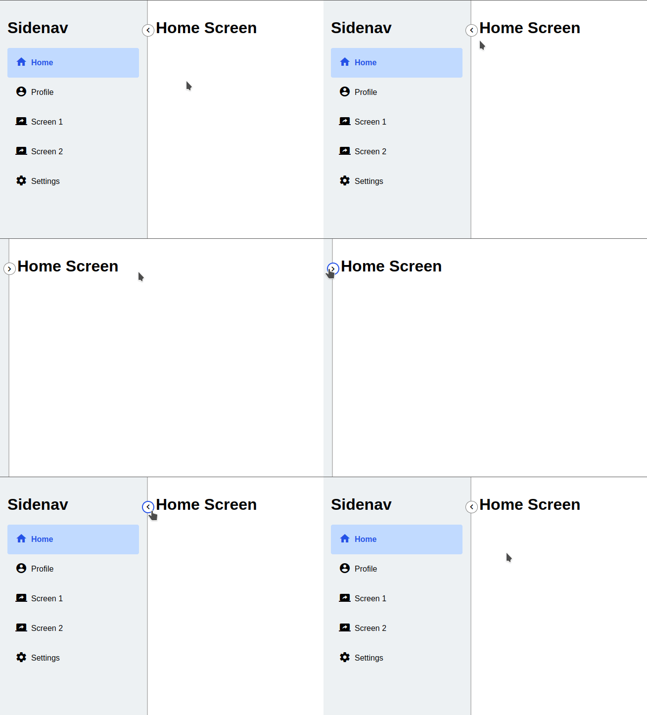
Here’s how expanding and shrinking the sidenav looks now:
I used this site to create the curve for the sidenav animation: https://cubic-bezier.com/#.02,.68,.63,.98
here’s a link to the final implementation
Conclusion
In conclusion, we have successfully built a toggleable sidenav component in Angular by managing the state using a service, creating a toggle button element, implementing the toggle logic, handling the content within the collapsed sidenav, and adding smooth transitions for a seamless user experience.
This customizable sidenav component can now be easily integrated into your Angular projects, enhancing your application’s usability and appearance.