Skeleton
- Skeleton
Skeletons are placeholder elements that are displayed before the actual content is loaded on a webpage. A skeleton is usually a light gray box or circle that you see on websites like Medium, YouTube, etc. Skeletons convey a visual impression of the feature, which gives them an advantage over spinners.
There are two types of skeletons — inline and standalone:
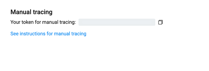
Inline skeleton
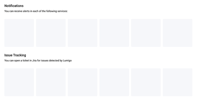
Standalone skeltons
We’ll create a structural directive that’ll help keep our code DRY and enable skeletons’ creation during the loading process. First, let’s create a rectangle skeleton component:
We’ve created a rectangle component that takes width, height, and a custom class name. A bit of CSS animation adds a nice pulse effect to it.
Now we can use it in a structural directive and create as many rectangles as we need:
There are several inputs: the loading status, number of rectangles to render, width and height, and custom class. We render the rectangle components based on the inputs provided when loading property is true; otherwise, we render the template.
Now we can use it in our templates:
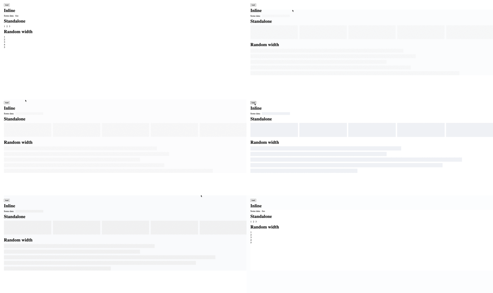
What’s Next
This was a minimal demonstration of what we can do with structural directives. Some more ideas are below:
We can add a type input and render different predefined shapes, such as a card skeleton.
We can enhance our directive also to support an error state.